OC’s New Brand States Who We Already Were
Scott Allen Hill jumped into the rigorous graphic design degree plan at Oklahoma Christian University as a transfer student. He graduated with a comprehensive portfolio showcasing his talents that served as a gateway to his career. After working for an Oklahoma City advertising agency, Scott returned to OC as a designer in the university’s marketing department.
OC’s fast paced environment required Scott to produce quickly in order to complete an average of 100 design projects each month. He experienced the wide variety of campus needs ranging from one sign to a 32-page magazine to a stage backdrop. Producing a high quality product with an eye on budget, while also understanding the needs of individual clients within the context of the university, proved to be a challenge. Developing these skills helped to prepare Scott for entrepreneurship.
Scott launched his design studio in Denver, Colorado. Local coffee roasters and corporate clients soon expanded to include Realtors from Beverly Hills and educators from Sydney, Australia. At the peak of the design studio’s success, Scott’s work had also reached a climax. His leadership role did not provide the mentorship and growth he craved. Scott took a counter-intuitive career move, leaving a thriving company that he had started to become an employee of Original Champions of Design (OCD) in New York City. Scott made the move in hopes of elevating his brand strategy skills to match his design abilities.
“OCD specializes in strategic brand identity systems and that became my new playground for challenge, risk-taking and professional growth,” Scott said.
While at OCD, he refined his design and client relation skills working with clients like the NBA, MTV, New York Times Magazine and worked on a major rebranding project for Dartmouth University.
In 2017, Scott returned to Oklahoma City with wife Ashlee and daughter Sylva, re-engaged with OC as an adjunct professor and took on the career title of design director for Switch, a branding agency headquartered in Dallas, Texas.
Scott’s return to campus combined with his experiences pushed him to passionately pursue a rebranding project with OC. Driven by a love for his alma mater, he initiated conversations with Chief Communications Officer Risa Forrester.
[quote from Risa] “I was familiar with Scott and knew working with him would be big time,” said Risa. “We were looking for ways to be more efficient and effective in our work, our brand had become scattered and unfocused, the timing was perfect.”
Creative Director Kimi Dalman founded Switch in 2004. As the grand daughter of the late Bobby Roberson and Life Trustee Millie Prince Roberson, she had a high level of interest in the OC project. Kimi pulled herself away from running the company to lead the OC rebranding team.
“Our process honors institutional foundations. Rather than attempting to find out who OC should be, our goal was to creatively articulate who OC already was,” said Kimi.
That process began with targeted focus groups. Kimi and Scott soon learned the project would be more far reaching than they anticipated. The focus groups took on a depth and direction beyond logos and signs to include social and racial issues, the role of women on campus, the state of the Church of Christ and what OC would represent moving forward. The scope of the project expanded to include more than 80 hours of interviews with over 100 individuals from 34 departments and student groups.
“There was a lot of pressure! Our non-profit, faith-based clients are very important to us. I wanted to make Kimi proud as I represented her company. This was a deeply personal project and I wanted to get it right,” said Scott. “The difficult conversations centering on race and gender caused me to reflect on my time as a student. As an individual, did I contribute to making these issues better or worse?”
Switch returned an 85-page reflection report including a thorough analysis of the former brand, an audit of OC’s marketing department and consensus from the interviews. Eight major insights remained consistent.*
01 OC’s identity is often defined by comparison to other universities, especially those affiliated with the Church of Christ.
02 School pride is segmented to departments or clubs and often found in silos.
03 Many people in OC’s community are forward-thinking and resourceful.
04 Some embrace the phrase “OC is home.” Others - often those on the margins - describe experiences that cause them to question if OC really is home for all.
05 Student and faculty accolades are lost in the current marketing pitch.
06. OC is willing to confront uncomfortable and challenging topics.
07 No one can articulate the meaning of the OC shield.
08 The marketing office must adapt to meet current project loads and improve missed deadlines.
OC Creative Director Tessa Wright leads the university as brand guardian. She worked closely with Scott to determine what it would mean to roll out a new brand. Her institutional knowledge of OC equipped her to manage the massive undertaking.
“I interned as an OC student then received a job offer. That eventually grew into a management role. I’ve had a wonderful career and experience at OC, but not a lot of outside perspective,” Tessa said. “I learned simple things from Scott, like building presentations, and I gained big things like passion and inspiration that infused our whole team.”
Both Switch and the OC marketing team researched other universities and companies who experienced a comprehensive rebrand. The risks were great. Some new brands had been categorically rejected by constituents. It was a stressful process for both client and agency.
“We are careful with what we put in front of clients because if we push them too far outside their comfort zone we will lose their trust. With Risa, we had her support and assurance that if we remained true to our process and produced our best work, she would stand behind it, implement it and defend it,” said Scott. “It was super empowering.”
Moving forward with the security of client trust, Switch leaned heavily on groundwork and the results of extensive research. The team uncovered some interesting facts like, Eagles do not describe their pride in the same way that alums from many other universities do, especially those hailing from large, flagship publics. But, incredible pride is found in very specific relationships and connections. Stately columns, football tailgates and sorority houses do not grace our campus. However, incredible individuals root for one another daily through honest relationships and an innovative, creative spirit.
At most universities, people want to be attached to the brand. At OC, our people defined the brand. Switch brought forward a brand that is unlike any university, but illustrated OC’s uniqueness.
The brand strategy focused not on the whole, but the parts, speaking of specific people, stories and accomplishments rather than abstract statements.
The story is of a group of passionate Christ followers made up of educators, learners, seekers and creators. Driven by mission, not just majors, we believe everyone has an important significance to this world. You are wanted here - and great things are expected of you.
The brand speaks to and with our audience, avoiding buzzwords and marketing speak. The message is conversational, warm and sincere.
The new OC brand rests on four cornerstones.
01 We are personal, which means we believe in treating each student, from admissions to graduation, as an individual with their own unique context. And because of this, OC is home to uncommon stories.
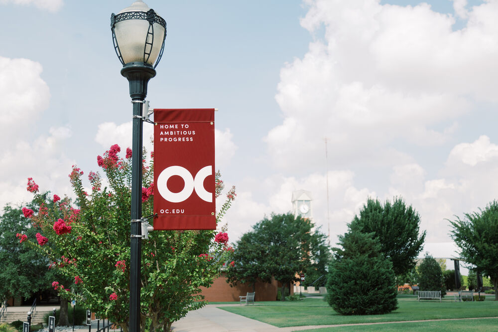
02 We are innovative, which means we believe excellence in our educational fields demands forward thinking, nimble creativity and a yearning to always learn more. And because of this, OC is home to ambitious progress.
03 We are challenging, which means we believe our community is a place for students to be themselves, ask questions, explore, debate and grow as they learn about the world around them. And because of this, OC is home to complex dialogue.
04 We are missional, which means we believe students are more than their major. We help students find Christ’s calling for them and equip them to be change makers in the world. And because of this, OC is home to extraordinary callings. Our communication style keeps these cornerstones in the forefront.
The new tagline is: The World Awaits Your Story.
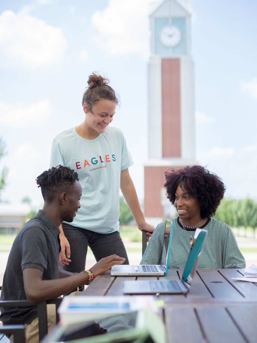
The former shield logo had been designed to look like a university logo. The identity of the new brand is compellingly Oklahoma Christian University and nothing else, just OC looking like OC. The bold OC logo is simple, clear, open and to the point. It pays homage to the architectural style of OC’s mid-century campus, ever moving forward, seeking growth and innovation. Important to our design team, it is reproducible, scalable and easily personalized. It’s pragmatic and meant for everyone, whatever your story may be.
While we stand on our iconic maroon and gray, the new color scheme expanded to include a dynamic tertiary palette. The brand stays consistent while facilitating flexibility for the various departments, events and initiatives. OC is many different things to many different people and this palette allows us to visually tell those stories.
Our mid-century modern architectural style inspired the new typography. The geometric structure aligns well with historic signage on camps and contrasts with our long standing tall and condensed primary typeface. Retaining the primary typeface allowed us to keep a vast majority of campus signage and avoid the financial cost of updating all of the signage.
Scott teaches students that a brand must always stand on its own. You can’t be there to defend it or explain the research and the data. While he would really like to speak to each person of all of the things he discovered and uncover the motivation for every detail, he will just leave this here for you to interpret for yourself.